CASE STUDY
Wilson Funeral Home
Client: Wilson Funeral Home
Role: Art Direction + Design
Project Overview
Wilson Funeral Home, originally known as Devine Funeral Home (founded by my great-grandparents and where my grandmother grew up), was established in the 1890s. Seeking to modernize their brand identity while preserving a sense of history and dignity, the funeral home needed a refreshed logo that would better reflect its legacy of care and service.
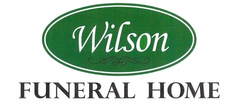
The previous logo featured a script-style wordmark within a green oval, paired with decorative flourishes. While this design emphasized tradition, it felt dated and lacked the sophistication required to capture the funeral home’s long-standing reputation for quality. Additionally, this design was not unique to the business, with similar marks found online for unrelated industries like landscaping. This overlap highlighted the need for a distinctive, ownable visual identity that could stand apart in a crowded market.
Design Objective
Create a timeless, respectful wordmark that clearly conveyed the business’s heritage while embracing a more contemporary, refined aesthetic.

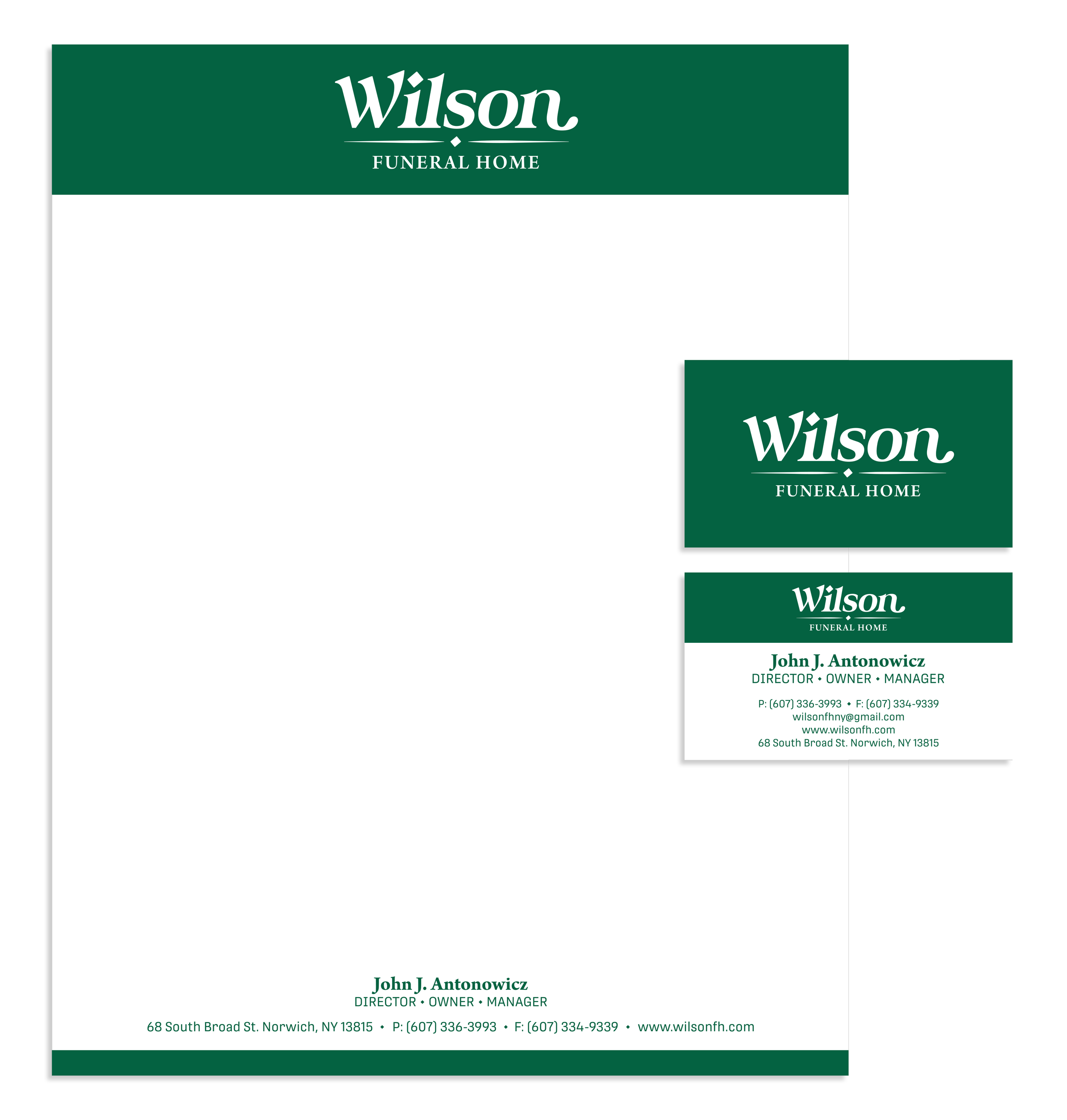
Before + After
The original logo relied on a classic script within a green oval, paired with a traditional serif for “FUNERAL HOME.” While this approach signaled tradition, it lacked the refined character and visual distinctiveness necessary for a family business with over a century of history.
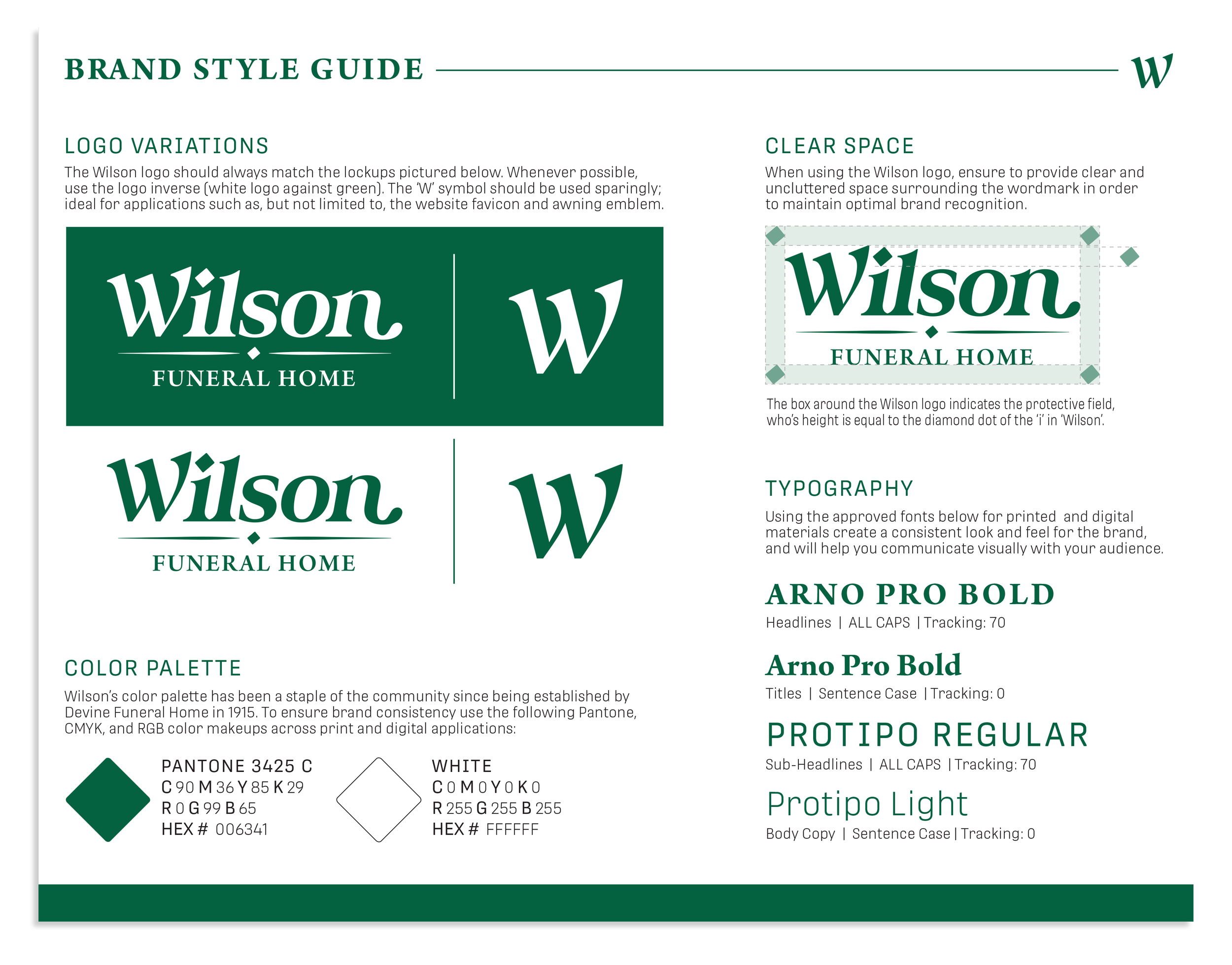
The updated wordmark introduces a distinctive serif typeface that maintains a classic, dignified presence while incorporating subtle, modern touches. Key features include:
Refined Letter Forms
High-contrast strokes create thick and thin transitions, adding a traditional elegance reminiscent of early print typography, aligning the design with the funeral home’s 19th-century origins.
Balanced Design
Sharp, angular serifs on the ‘W’ and ‘n’ contrast with the softer, more flowing curves of the ‘i,’ ‘l,’ ‘s,’ and ‘o,’ creating a balanced yet refined identity that feels both personal and professional.
Subtle Personality
The distinctive cut of the ‘n’ and the subtle, almost calligraphic flair in the terminals add a touch of personality without straying too far from the expected formality of the industry, reflecting the care and attention to detail that define the funeral home’s approach.
Symbolic Diamond Motif
The geometric diamond element, positioned between the dot of the ‘i’ and the divider, provides a refined, slightly classical touch. This detail offers a subliminal nod to quality, excellence, and elegance, aligning with the values of trust and dependability critical to the funeral business. It also subtly references the Celtic and Irish heritage of the Divine and Wilson families, connecting the brand’s roots to its visual identity.
Impact
The redesigned wordmark captures the dignity, tradition, and trusted nature of Wilson Funeral Home. The clean, modernized approach respects the brand’s long history while creating a more contemporary, recognizable, and ownable presence. This design now reflects the quality and care the business has offered for over a century, providing a fitting visual representation for generations to come.