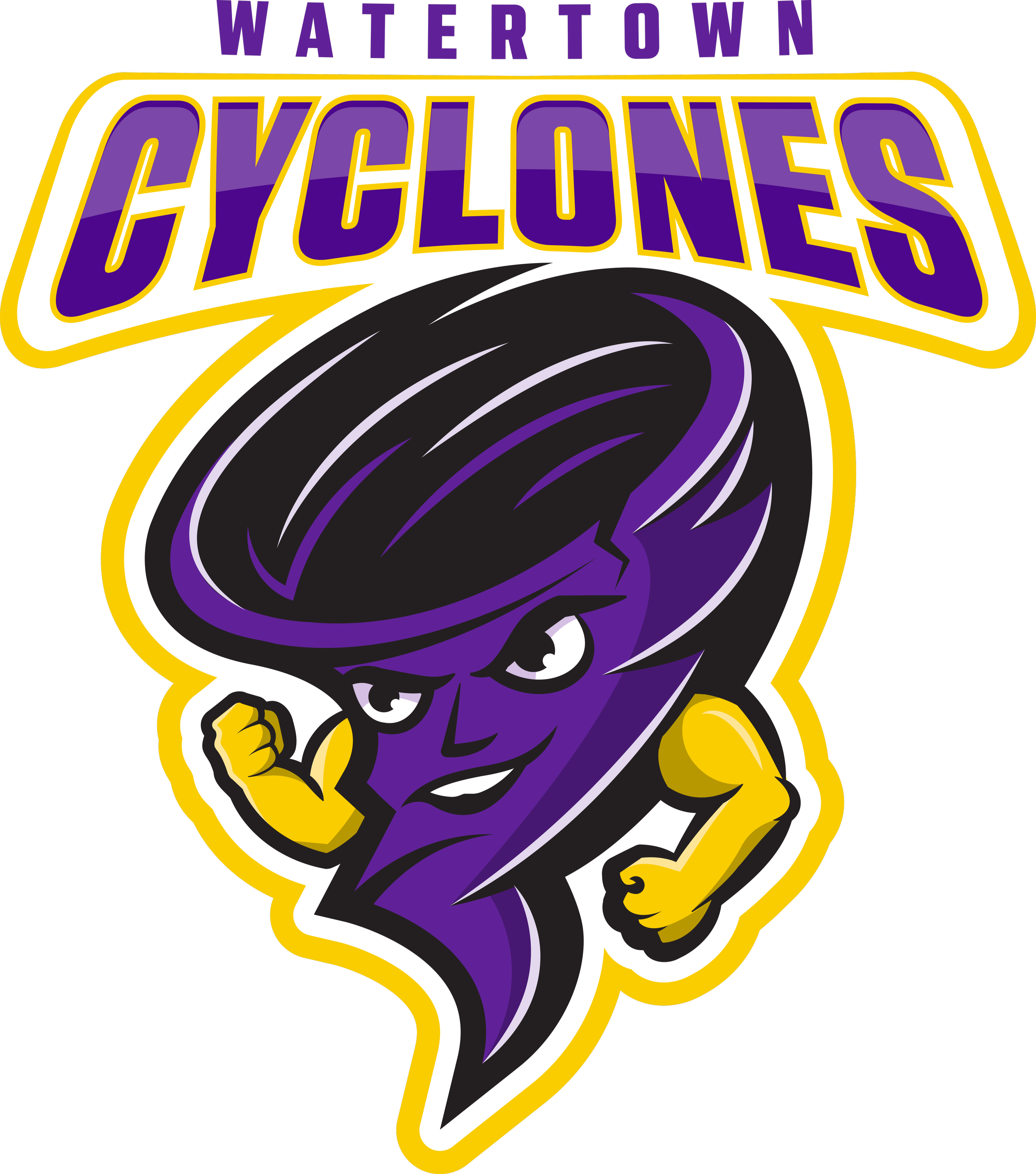
Watertown Cyclones
CASE STUDY
Client: Watertown City School District
Role: Art Direction + Design
Project Overview
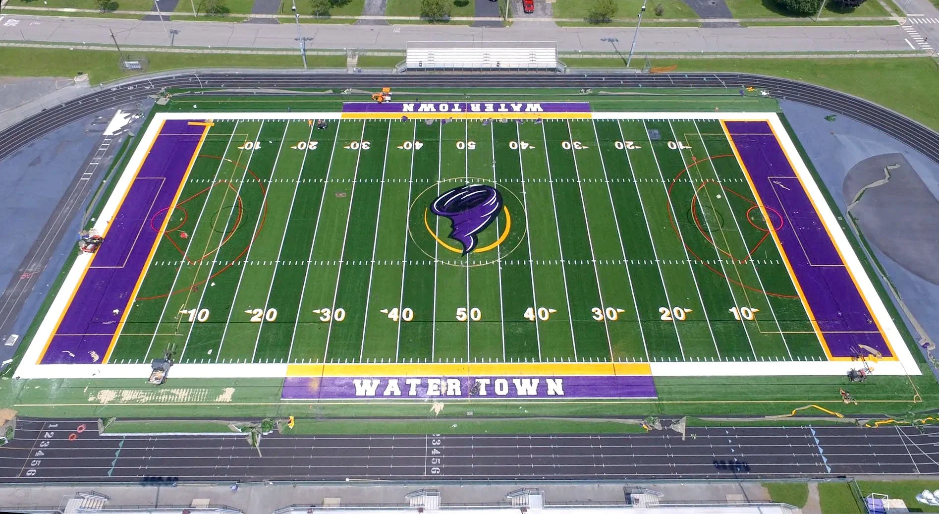
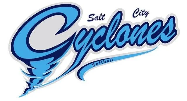
In early 2023, I designed a custom cyclone logo for the intermediate school where my husband works. During my research, I discovered that the Watertown City School District’s existing athletics logo was unoriginal and unlicensed. Later that year, the district announced a major capital investment in a new athletic turf project—which with my previous knowledge, caused concern about the risks of moving forward without a legitimate, ownable visual identity.
I proactively contacted the superintendent to share my findings. After an internal review, it was confirmed that the district had no record of licensing the current mark. As a result, the administration decided not to proceed with the project until a new, fully original identity could be established.
This led to a unique opportunity: I was tasked to lead a comprehensive rebrand, including a new mascot and athletics logo, and a full overhaul of the district’s outdated visual identity—eliminating the negatively perceived schoolhouse illustration, creating a cohesive, modern system that unifies all departments and programs under one identity.
Design Objective
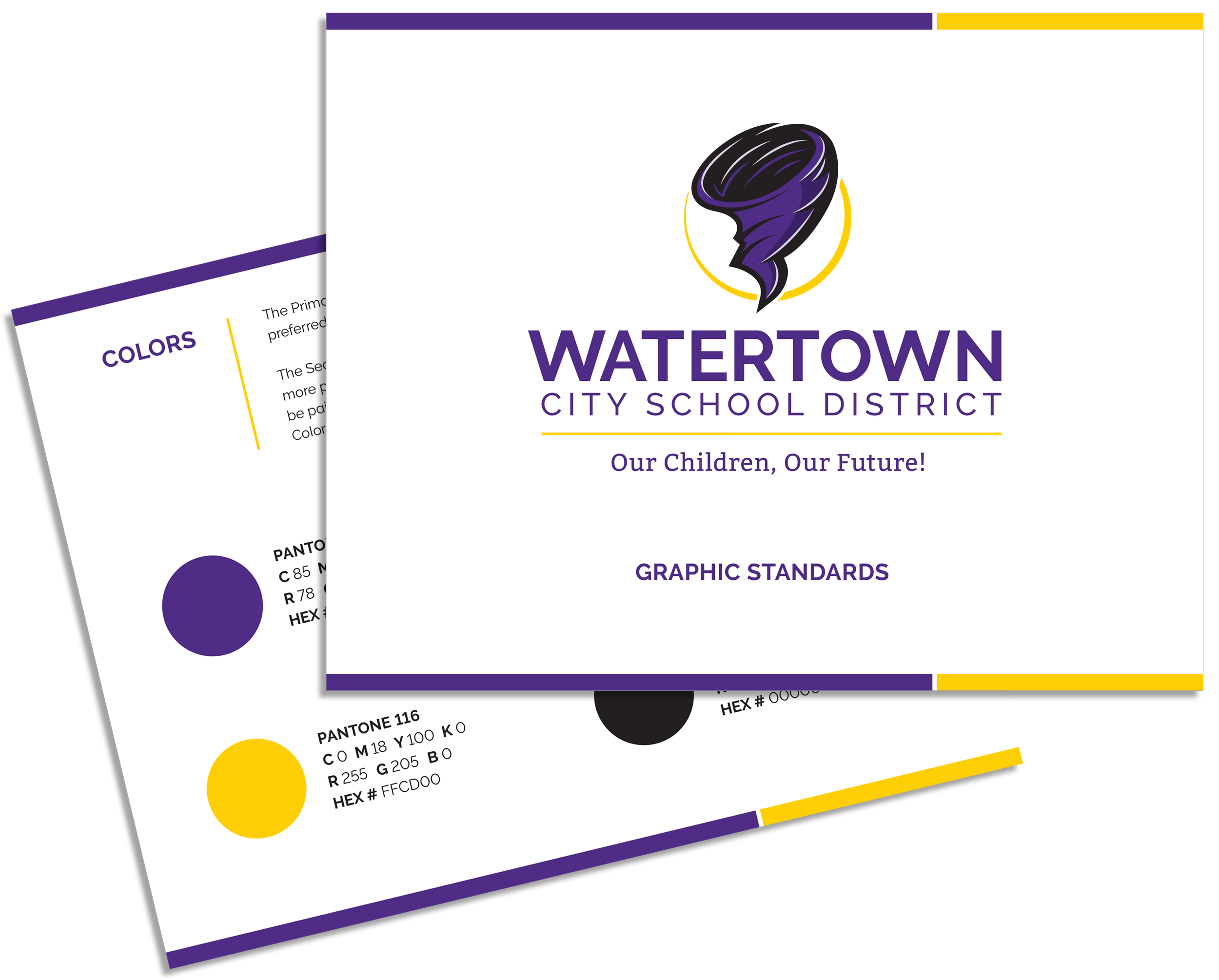
Create a new visual identity for Watertown City School District that reflects unity, strength, and school spirit. The new athletics mascot should personify the cyclone mascot and reintroduce gold as the district's third core color.

Challenges Identified
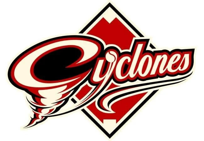
Unlicensed Logo Use
The athletics logo was unoriginal and potentially in legal violation due to lack of licensing.
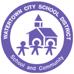
Outdated District Identity
The schoolhouse logo was dated and carried negative historical connotations within the community.
Lack of Unified Branding
The visual identity was inconsistent across schools and departments, diminishing the district’s professional presence.
Design Process
1. Research & Discovery
I began by auditing existing brand materials and engaging in conversations with key stakeholders to understand the district’s mission, values, and long-term goals. I also analyzed visual identities from comparable school districts to benchmark contemporary design standards and identify opportunities for differentiation.


2. Concept Development
For the athletics department, I designed an original, dynamic cyclone mascot that incorporated the district's core colors: purple, white, and the newly introduced gold. The design aimed to honor tradition while introducing a bold, contemporary spirit. For the district-wide identity, I transitioned away from the outdated schoolhouse illustration. I developed a modern, versatile logo derived from the core shapes of the mascot—stripped of personified elements—to create a cohesive system that unites all schools while allowing for individual expression.
3. Presentation & Feedback
I presented multiple concept rounds to the superintendent and key stakeholders, incorporating feedback at each stage. This collaborative process ensured the final identity aligned with community values and district-wide vision.
4. Finalization & Rollout
Once approved, I developed comprehensive brand guidelines covering logo usage, typography, color palette, and digital asset implementation. I also consulted with vendors to guide signage and interior vinyl applications, supporting a smooth and consistent rollout across the district.
Design Solutions
Athletics Mascot
A bold, custom cyclone mascot was developed to embody strength, energy, and school spirit. Expressive motion lines convey movement and intensity, while the introduction of gold as a core accent color adds vibrancy and visual impact, elevating the overall design.
District Logo
A clean, modern mark was designed to reflect forward momentum and institutional integrity. Straying away from a traditional serif typeface introduced a friendlier, more contemporary aesthetic while still maintaining a sense of credibility. A complementary modern serif was reserved for the new tagline to add subtle contrast and sophistication. The logo system was built for versatility, with variations that adapt seamlessly across departments, publications, and digital platforms—visually linking to the athletics mascot to ensure consistent brand cohesion across academic and spirited contexts.
Typography & Color System
A unified type system and refined color palette (purple, white, and gold) were established to ensure consistency across all communications. The chosen fonts and colors perform effectively across digital, print, and environmental applications, reinforcing a strong and recognizable district-wide identity.