Black Ice Re-Design
LITTLE TREES
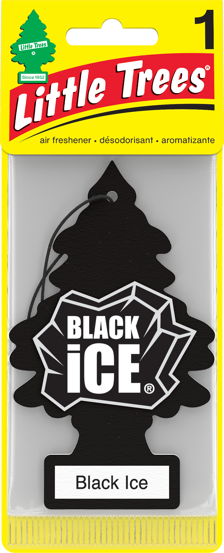
Design Objective
Refresh the visual identity of Black Ice, the world’s #1 car air freshener, originally introduced in 2004. The goal was to modernize this iconic logo while maintaining the brand equity and consumer recognition it has built over decades. This update required a careful balance, retaining the trademarked shape and distinctive character that loyal customers instantly identify, while aligning with the brand’s evolving design language and contemporary market trends.
Key Updates
1. Added Depth:
Enhanced the ice cut details to introduce more dimension and realism, creating a dynamic, multi-layered effect.
2. Refined Outline:
Tapered the silver outline to add contrast and a more organic, chiseled feel, enhancing the sense of mystery and edge.
3. Typography Optimization:
Customized the letterforms for a stronger, more intentional presence, improving overall geometry and brand impact.
4. Balanced Composition:
Adjusted proportions and perspective to maximize the mark's visibility while maintaining its iconic, powerful shape.