1906 Drops
CASE STUDY
Client: 1906
Role: Visual Identity + Package Design
Project Overview
In this hypothetical rebrand of 1906 Drops, I explored how strategic design can elevate a cannabis wellness brand by reinforcing its functional benefits, improving product recognition, and telling a more compelling visual story—all while preserving the clean, minimalist aesthetic of the original packaging.
My primary goal was to create a more medicinal, trustworthy, and memorable identity that reflects the brand's focus on daily microdosing for functional wellness. Through thoughtful use of color, iconography, structure, and a revised logo system, this redesign transforms 1906 into a bold, cohesive brand system that stands out both on shelves and in consumers’ minds.
Design Strategy
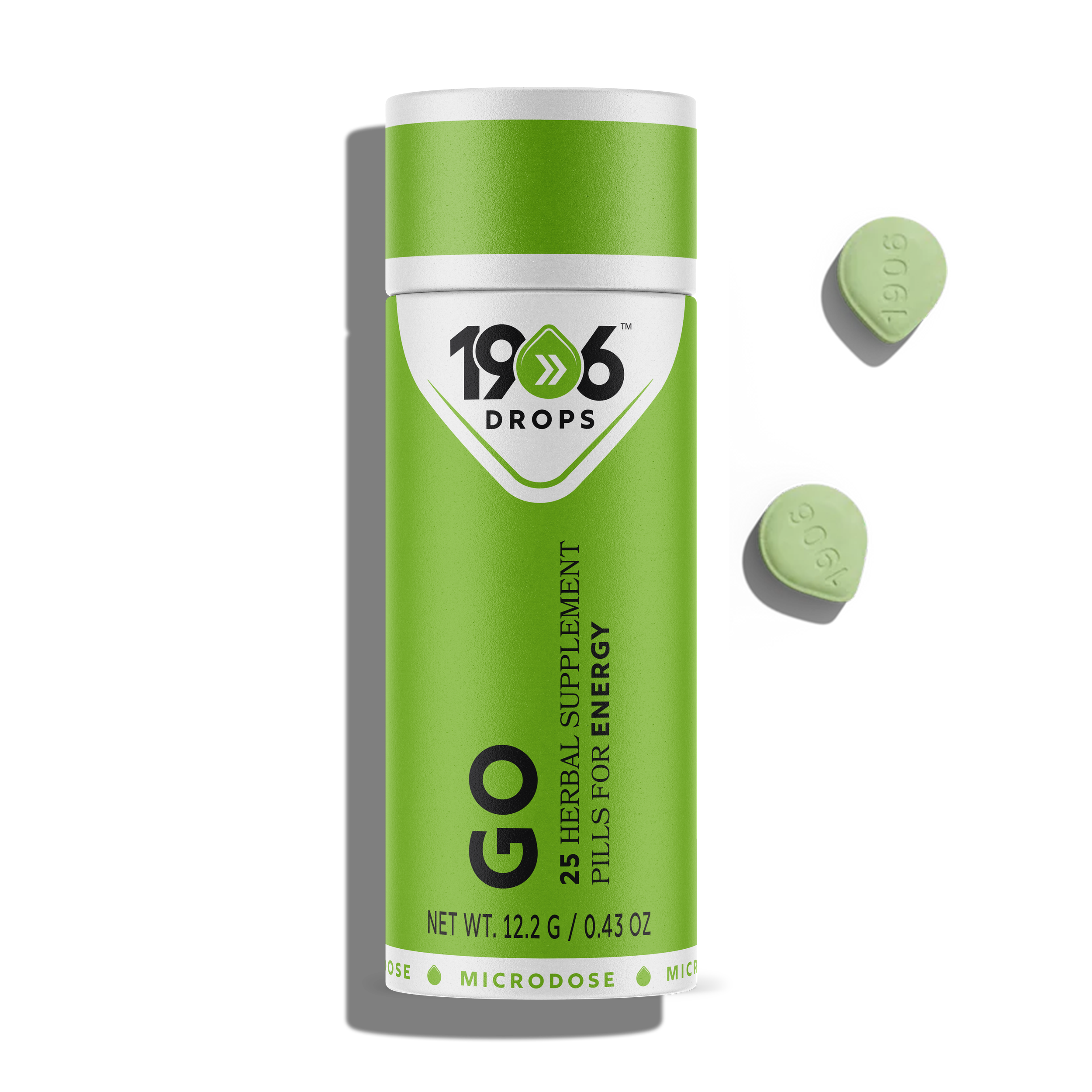
1. A More Purposeful Logo
The existing logo lacked memorability and emotional resonance. I reimagined the identity by incorporating the edible drop shape into the logomark—merging the brand name and product form into a unified symbol. Each drop is customized by color and iconography to reflect the specific function of the product, such as:
- A lightning bolt for Genius (brainpower)
- A heart for Love (arousal)
- A moon for Chill (relaxation)
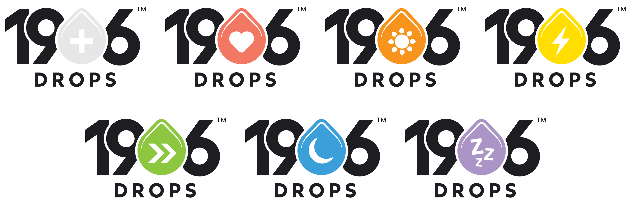
Impact
This change adds narrative value to the logo, turning it into a storytelling element and system anchor that enhances SKU differentiation and brand recall.
2. Introducing White for Clarity and Medicinal Cues
A key element of the redesign was integrating white space throughout the packaging—most prominently in the top third of the sachets and tubes. This design decision served multiple purposes:
- Signals cleanliness and precision, aligning with the health and wellness focus
- Offers visual contrast that improves readability and elevates the look
- Differentiates the brand from typical cannabis packaging, which often leans recreational or overly vibrant


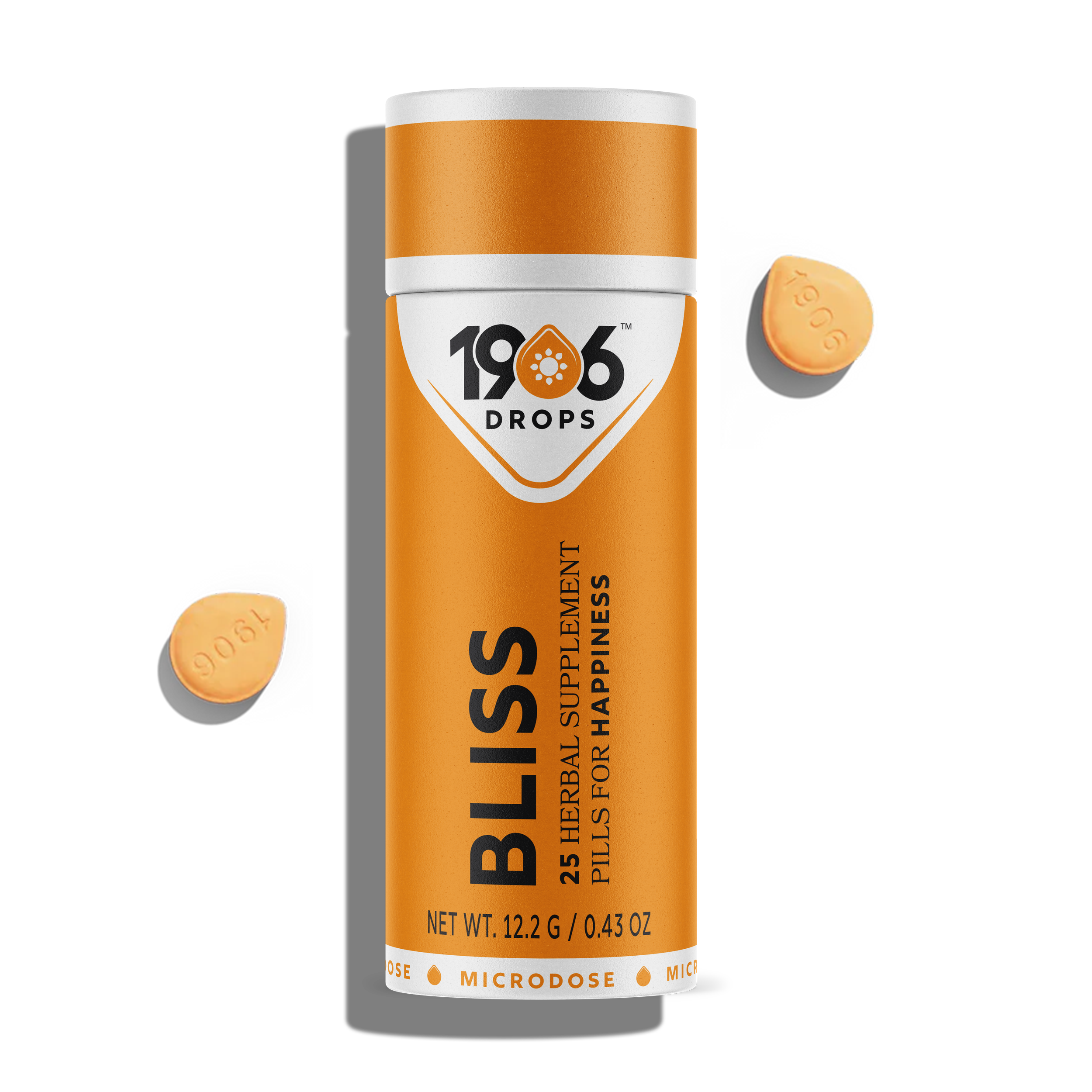
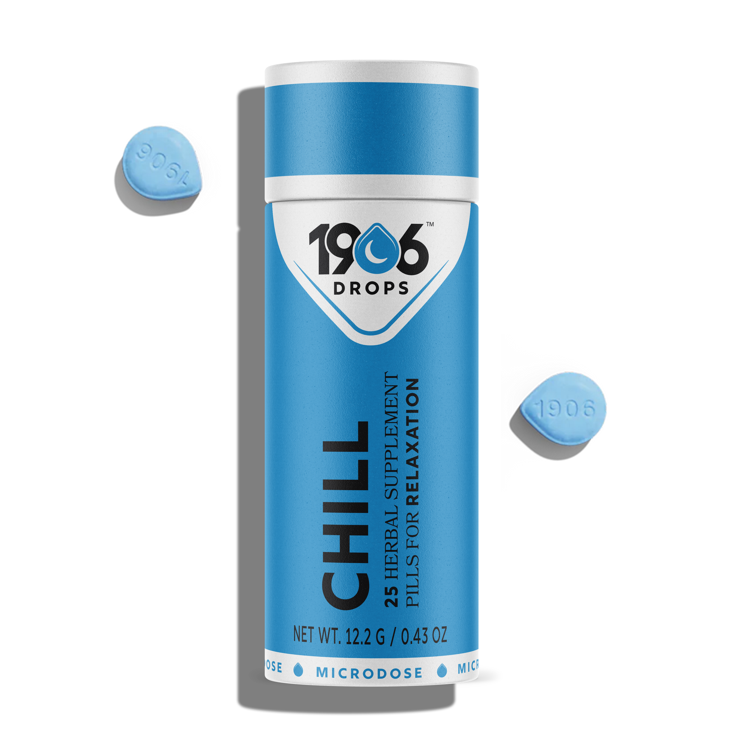
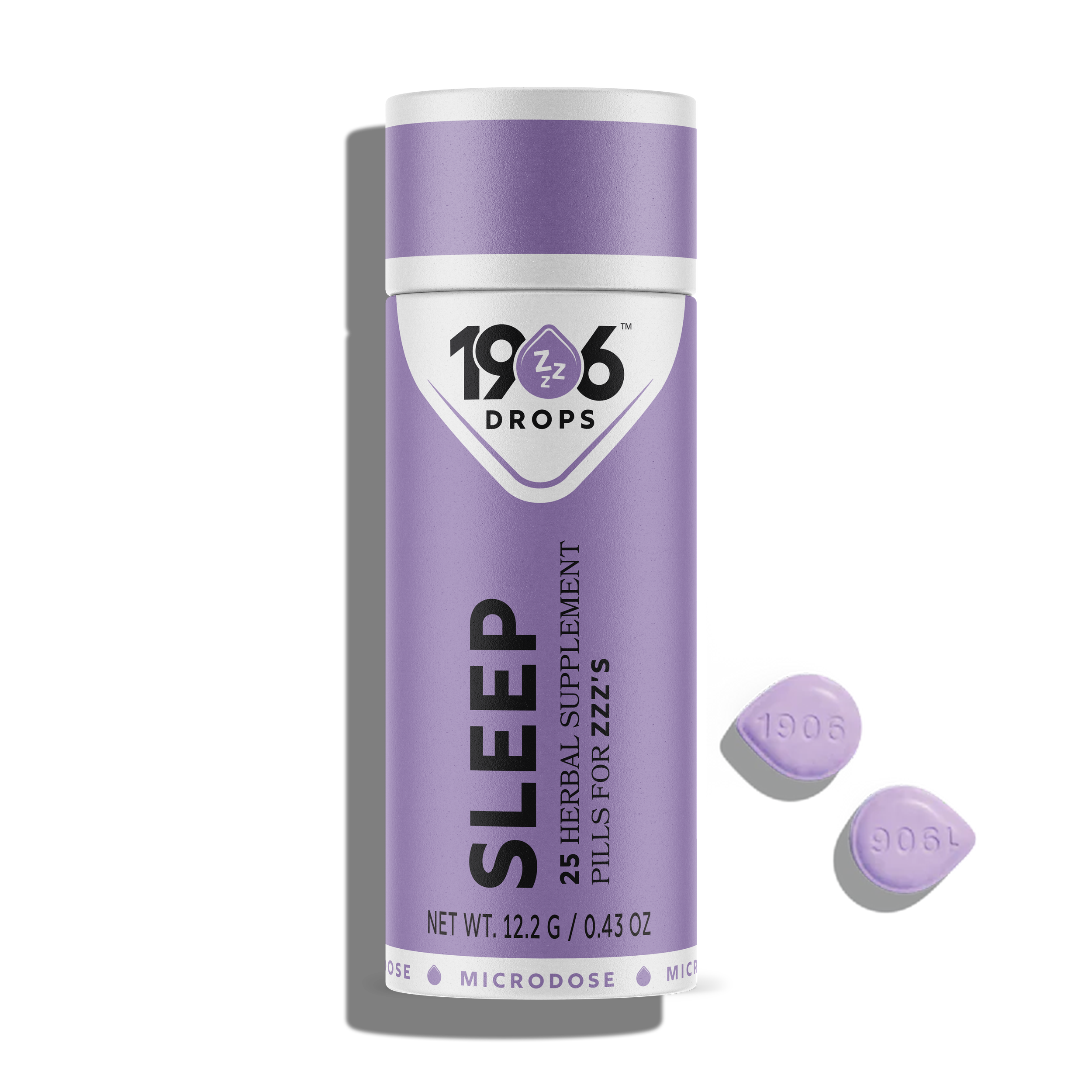
Impact
Utilizes the signature drop shape as a visual violator, anchoring the logo in a recognizable silhouette that is both functional and symbolic. Even when not consciously noticed, the repetition of this shape subtly reinforces brand identity and product purpose.
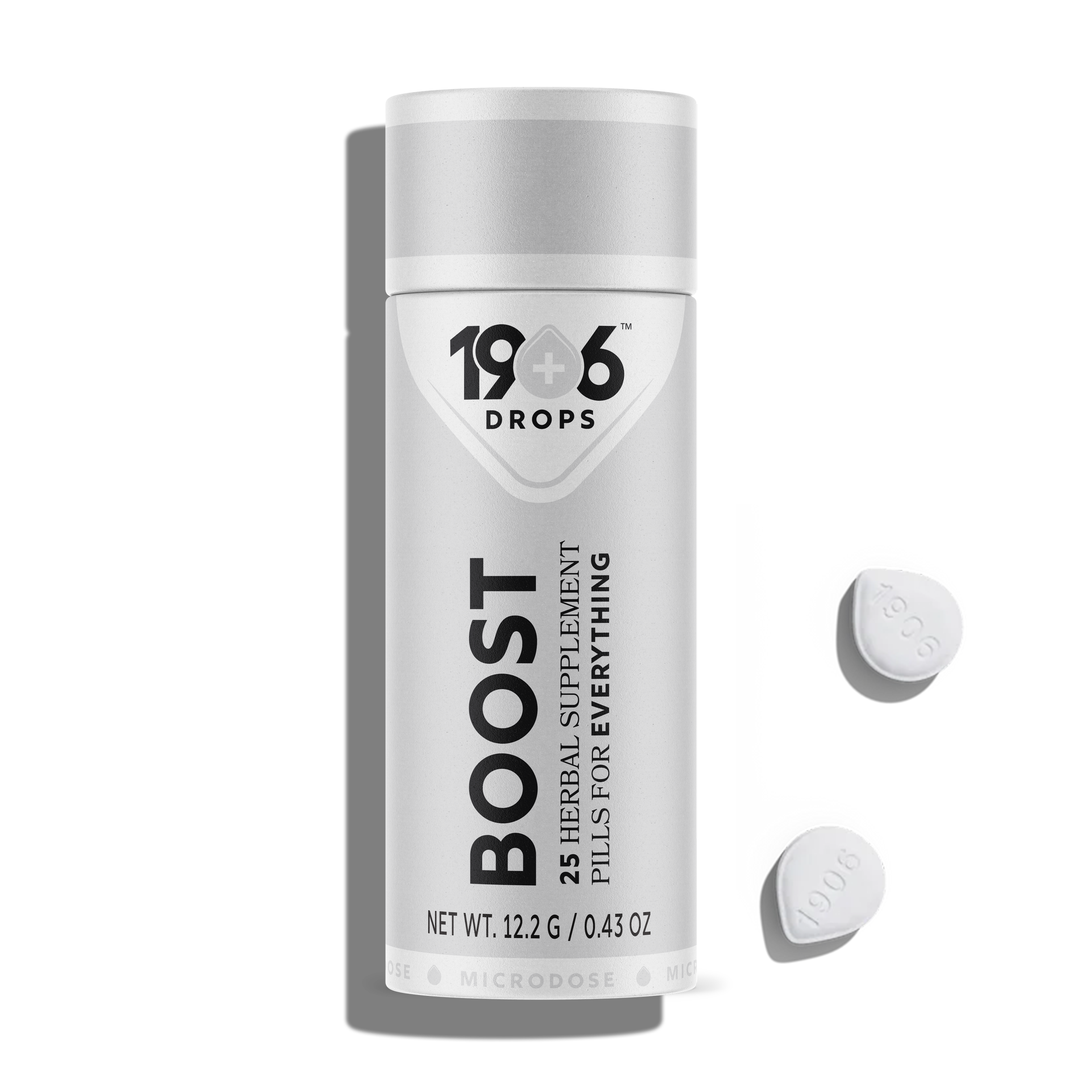
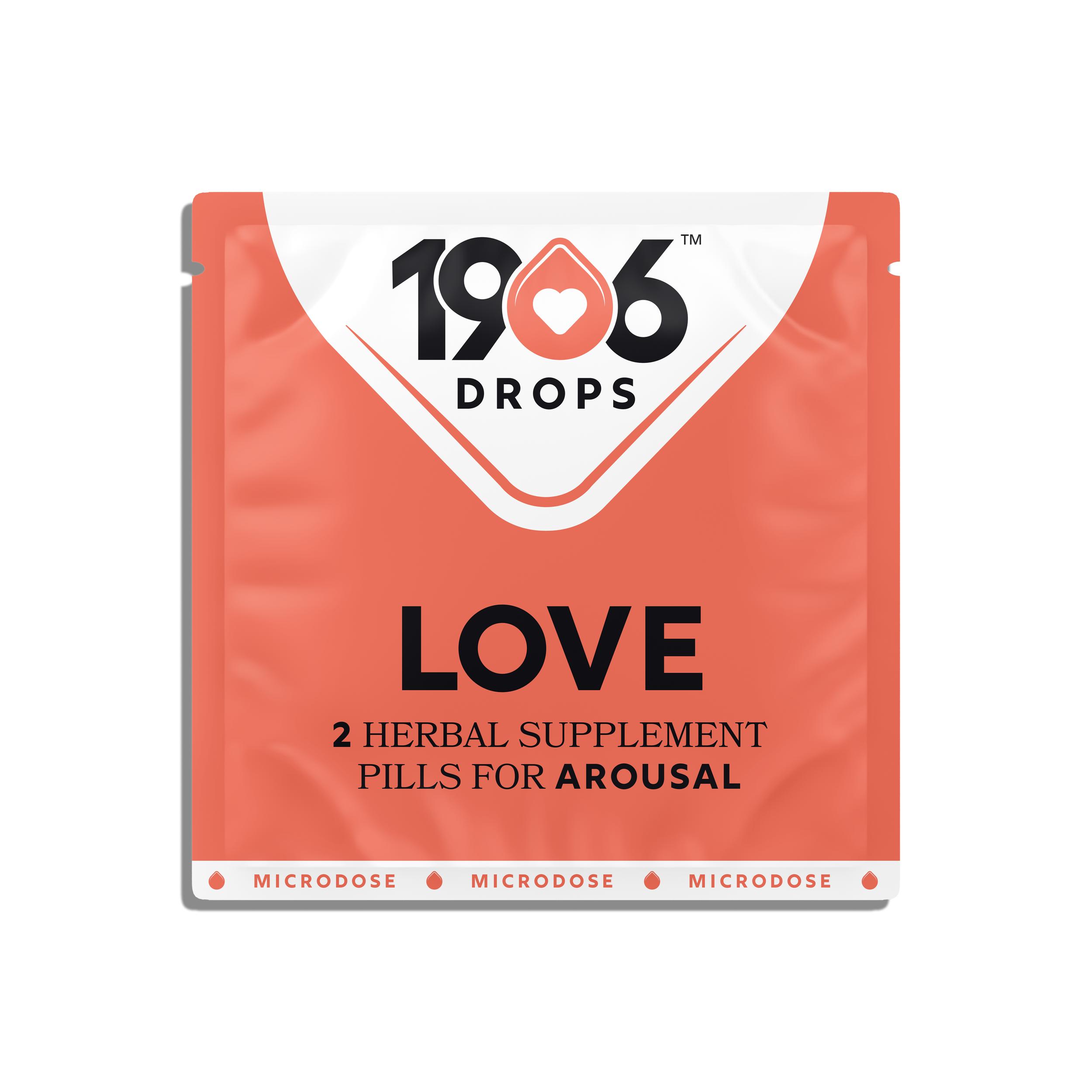
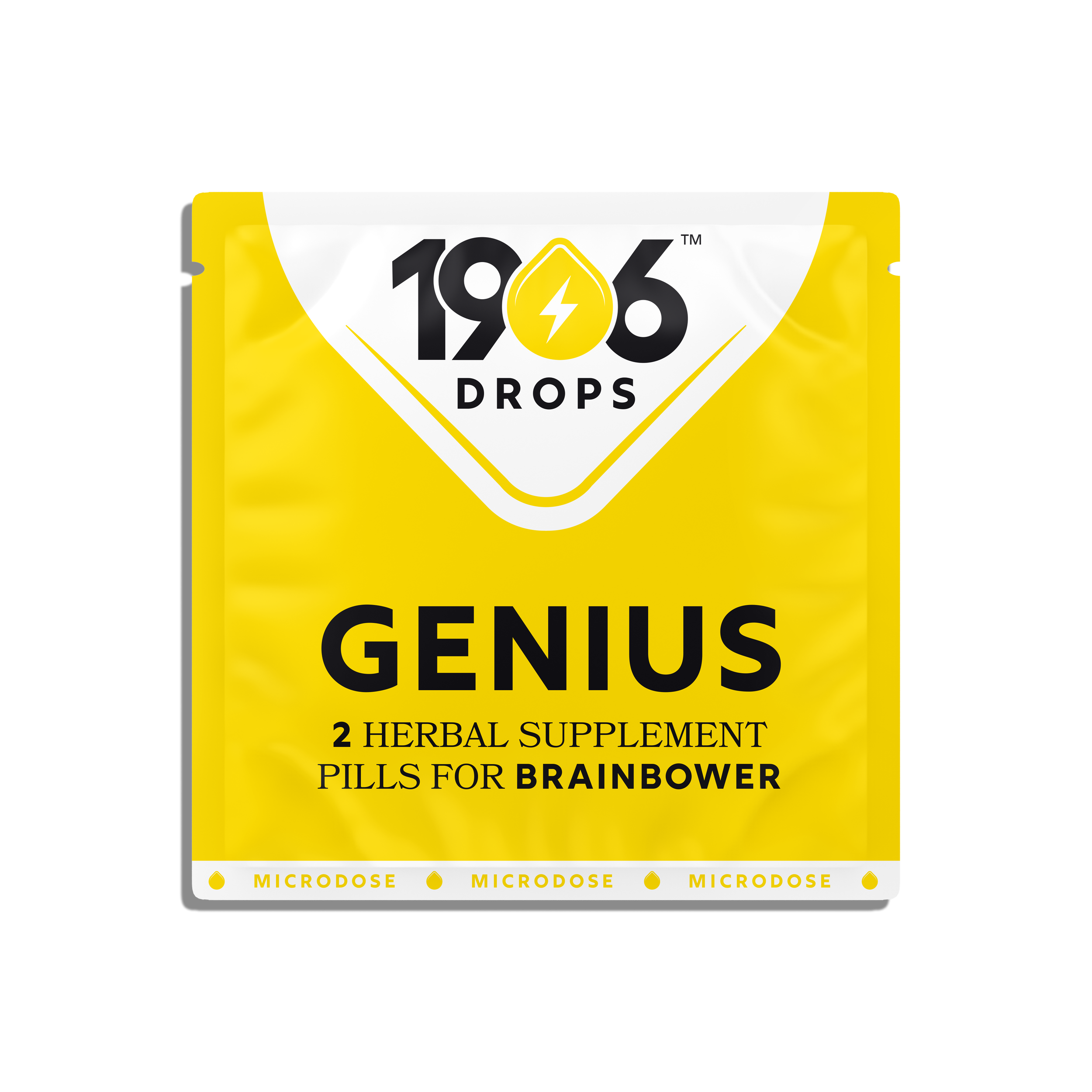

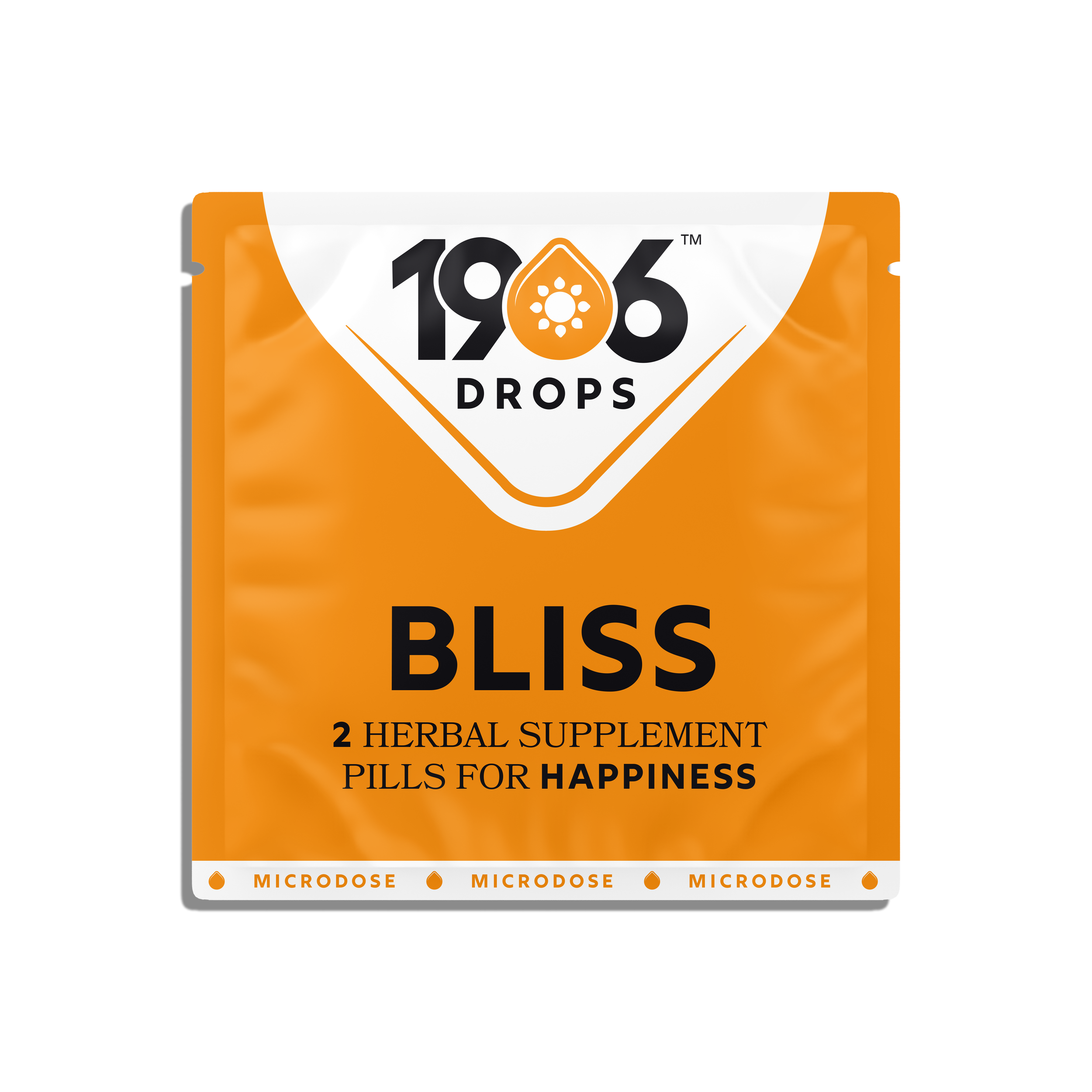
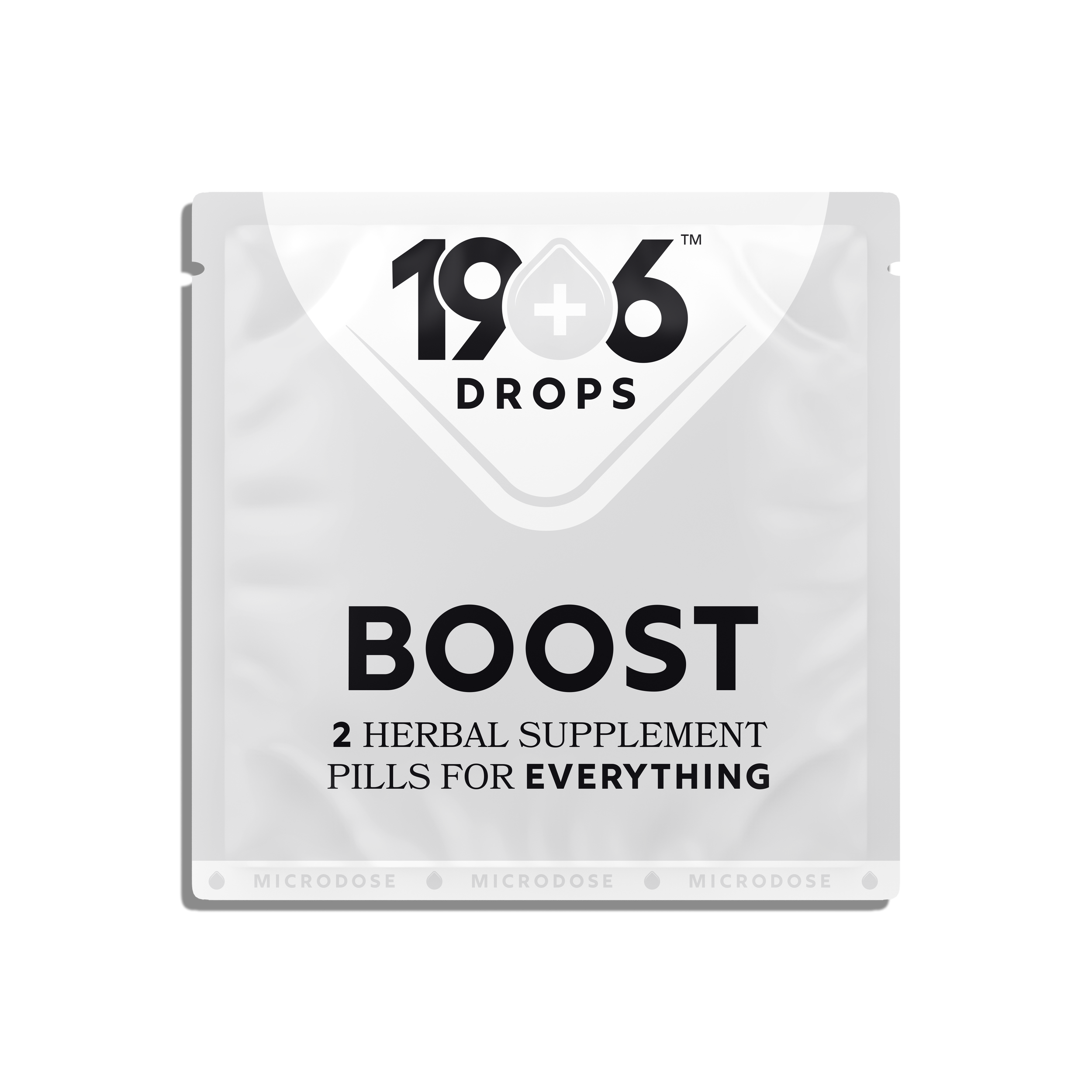
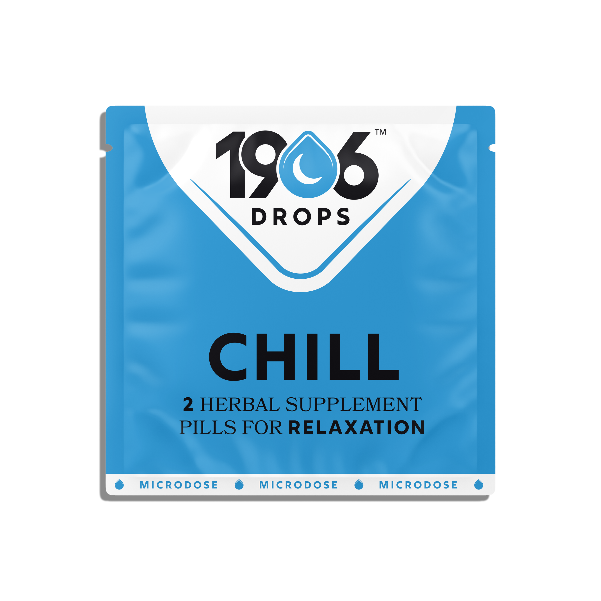
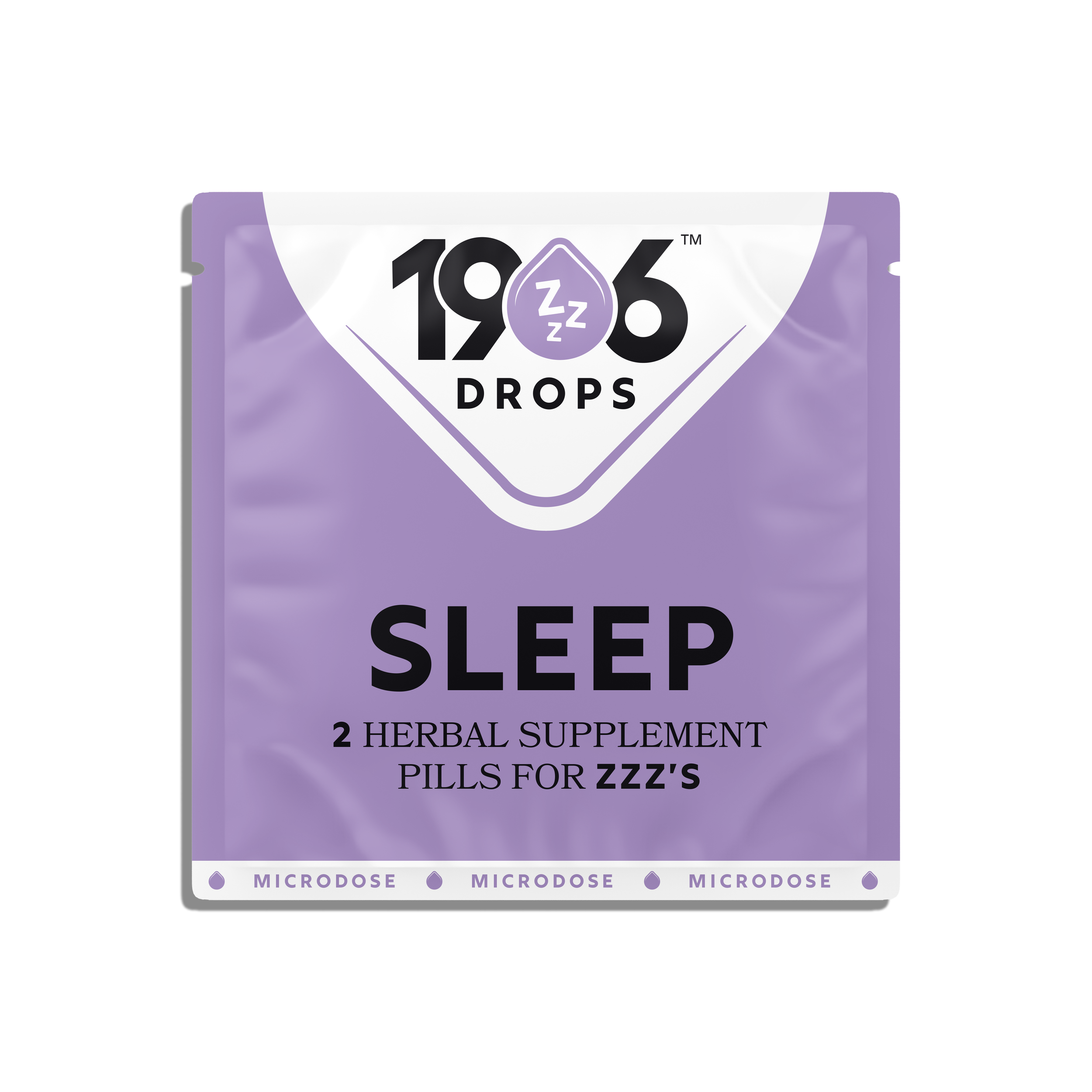
3. Functional Typography & Hierarchy
I maintained a minimalist typographic approach but reorganized content with a sharper hierarchy. Each package clearly presents:
- The brand and product logo at the top
- The product name in bold
- A concise benefit descriptor (e.g., “Pills for Energy”)
Impact
This structure delivers clear, fast information—critical for quick in-store decisions and repeat purchases.
4. A Visual Language System
The product line now operates within a defined visual language:
- Each SKU is identified by a unique drop icon and color.
- The drops also appear stacked in a vertical spectrum, creating a memorable visual motif.
- Colors are carefully chosen for emotional resonance and differentiation.
Impact
This systematic approach reinforces consistency, makes the lineup easy to navigate, and enhances long-term brand recognition.
Packaging Format
Both pouch and cylinder formats remain familiar to the original brand but are refined with:
- Improved layout balance
- Sleek use of color blocking
- Stronger presence on-shelf through bold simplicity
Outcome
Through this hypothetical rebrand, I demonstrated how small but strategic shifts—like the introduction of white space, a narrative-driven logo, and a cohesive icon system—can elevate an existing brand into something more distinctive, credible, and consumer-friendly. This redesign is not just about aesthetics—it's about transforming how 1906 communicates functionality, trust, and daily integration in a visually intelligent way.